This application visualizes the geographic distribution of aid spending (in USD) as a heat map. All of the data was obtained from aiddata.org.
Heat Map Analysis
Step 1
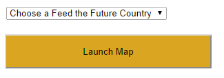
Before launching the application, choose a Feed the Future country from the drop-down. Then click "Launch Map".
Step 2
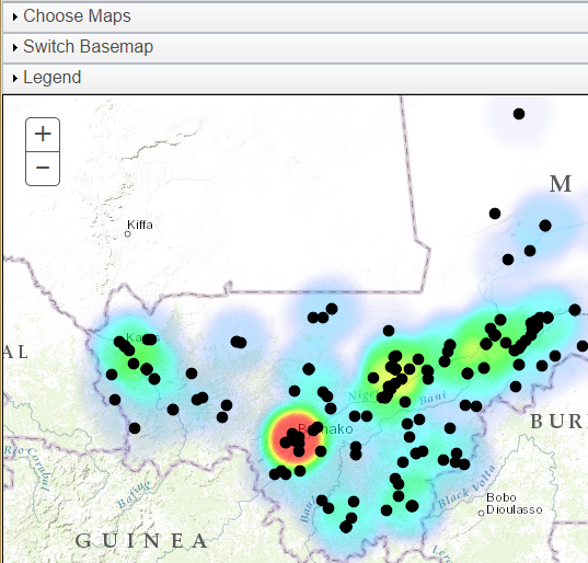
The application will open and display a heat map layer. The default layer is "All Projects".
Step 3
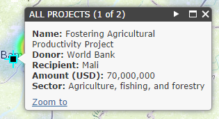
To view information about an individual data point, click on it. A popup will show with information about this data point. Some areas may have multiple data points in the same location. This is indicated by (1 of X) in the title bar. To see the information on the other data points, click the arrow in the title bar.
Step 4
As you navigate the map by zooming and panning, the heat map will automatically recalculate using only the visible points.
Step 5
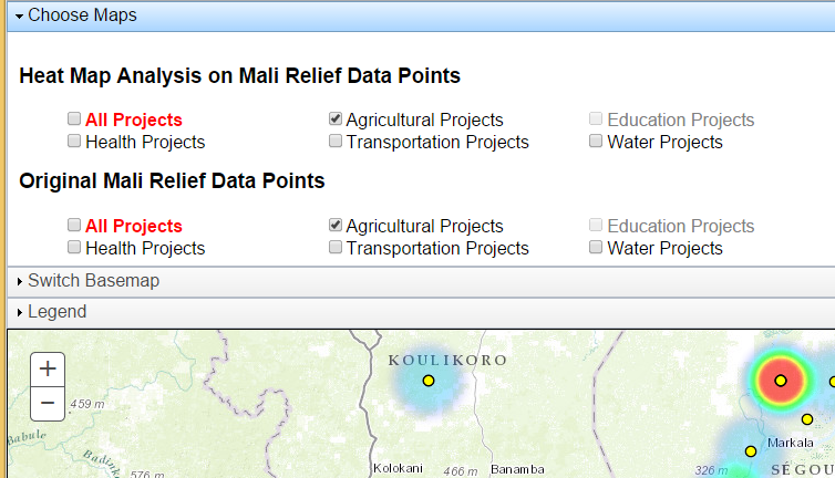
To change the heat map layer, click on "Choose Maps" to expand the Choose Maps panel. Uncheck both "All Projects" checkboxes and choose the heat map analysis and project points you wish to see displayed. You can choose to display the both the original project points and the heatmap, just the heatmap, or just the original project points by selecting or deselecting the checkboxes for the original project points and the heatmap.
Basemap
Click on "Switch Basemap" to expand the Basemap panel, then choose your desired basemap.
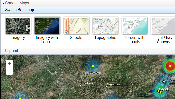
Legend
To see a legend, click on "Legend" to expand the Legend panel. Note that the heatmap updates on the fly, so colors represent high and low project spending of all currently visible points.
